A new Chrome extension for accessibility is making the rounds and for good reason.
ChromeLens is an extension that lives inside of your Chrome Developer Tools and allows you to run diagnostic tests on any webpage from the point of view of being visually impaired.
How Accessibility Compares to Browsing Habits
Visual impairment affects more than 10% of Americans, with almost 4% of Americans suffering from some form of visual impairment that is not considered correctable. This puts average web users with visual impairment at about the same percentage as users browsing with Internet Explorer.
While that comparison might seem glib, the truth of the matter is the developers still spend a moderate chunk of time making considerations for IE, weighing the pros and cons of using new technology depending on the audience’s browsing habits. Its an intentional decision, even if the decision, often correct, is to drop early-IE support.
There are some B2B sites, however, that receive a lot of traffic from large offices or cubicle farms, where the intranet-based infrastructure shackles users to older legacy browsers. If your analytics are that revealing an inordinately large ratio of users are coming from older versions of IE, suddenly your priorities shift.
Accessibility as a Universal Goal
In a similar vein, I design and develop for a nonprofit that is focused on a rare disease that primarily manifests in optic nerves, causing temporary yet recurring phases of blindness. If Google Analytics could track user health data, I’m sure we’d see some staggering statistics for our traffic (not that I’d want Google tracking that!). We know that visual impairment is an important issue for our users, it’s why we baked accessibility settings into our mobile app.
However, I’d like to see accessibility enter the wider discussion. It’s great to see other large tech companies taking steps towards this goal, but for anybody working in web or other forms of digital media, we all, myself included, could put in a little bit more focus.
Similar to the WordPress Five for the Future program, in which companies who profit off of WordPress are encouraged to give back 5% of their time to the open source project, I believe that as web developers, we should hold ourselves accountable to making reasonable accommodations as much as possible.
ChromeLens in Action
So all that is to say that based on some preliminary testing, I’m a really big fan of ChromeLens as a tool to evaluate your site for accessibility. There’s a number of tools out there that serve similar purposes, and I recommend you try any and all of them. That being said, I spent some time running the tests on the front page of my site, and here are a few of the results.
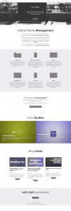
Accessibility Screenshot 1: Filters
Filters
One of the more interesting features, one that sets this ChromeLens apart, is the ability to view the webpage with custom colorblindness features. Overall, I use a pretty monochromatic color scheme for the site, relying on a few shades of green for links, buttons, and icons.
If you examine the screenshot, I’ve used the ‘Deutoronopia’ filter to remove all the green from the page. I wanted to see how clear any links or call to action buttons are without that green highlight color. Luckily, you can see the contrast between any buttons and the backgrounds help to maintain a strong sense of clarity for these buttons. This really highlights the importance of measuring contrast when making a color choice.
Recently I’ve been hearing about more negative results from so-called ‘ghost’ buttons or outline buttons where there is no background color, just some padding and a thick border around a word. Seeing the site through this filter helps me feel confident in my choice to move away from trendy ghost buttons.
The only button that does not have a clear contrast from the background is, ironically, the featured button in the top of the hero section. However, I actually don’t expect that button to be clicked too often, since most visitors want to read more before they actually click to contact you. So the button is there for consistency and convenience more than actual conversion.
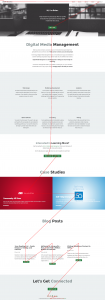
Accessibility Screenshot 2: Tracker
Tracker
How often do we use fancy layouts and flexbox to rearrange the elements on a page? Don’t get me wrong, I do love a great fluid grid, but sometimes we forget that screen readers are going to tell your story for you, and in the order it finds the elements.
The tracker feature draws a graphic overlay as you use the tab key, the main navigational tool for screen readers. The tab key follows the natural order of clickable elements, like links or input fields.
I’m glad to see that the general flow of the page is exactly as I’d like it to be. After seeing this, however, I do feel inspired to take the time to explore my site using only a screen reader to navigate.
While color-blindness and other forms of visual impairment only represent a fraction of our users, they also only represent a fraction of the disabilities that may affect web users. Thinking holistically about simple, meaningful content and authentic storytelling can help ensure that your message is able to be received.
Overall, this is a great little tool to have in your DevTools and an reminder of the importance of accessibility in web design. There are some other features included that I recommend spending some time with, along with a number of other extensions or website that can help you analyze the accessibility of your website. Here’s a link to learn more about ChromeLens and a big thank you to the team that made it.


Leave a Reply